Lets Go Bar Hopping!
Mark Twain said, “History doesn’t repeat itself, but it often rhymes.” In that spirit, I spent many, many hours reliving the past through the price action of the QQQ from 1999 to the present day, in an effort to find chart patterns that closely resemble what we are seeing in this market. The following five charts are most similar in size, shape, waves, moving average interaction, and overall price movement. Bear in mind that each of these patterns was chosen under the assumption that the QQQ returns to all-time highs before any larger sell-off. If the top of the market is already in, that’s a completely different set of patterns and data. Two of the five charts are from the final bull move before a major sell-off, so interpret that information as you see fit. If you love studying charts and detailed technical analysis, this is the newsletter for you!
The first bars pattern we will look at is from 2005. The 2005 bars pattern followed a strong recovery in the QQQ after a large bear market, which correlates to the 2022 bear market and our subsequent recovery. It had a 3-wave corrective pattern (ABC) from the high, where it retraced almost 76.4% of the most recent bull move. Its strong bullish move off the lows did not immediately bring it to new highs; instead, it retested the long-term moving averages twice before breaking to a new relative high. The QQQ went on to make new highs for two more years after this pattern played out.
2005 Original Bars Pattern

2005 Bars Overlay

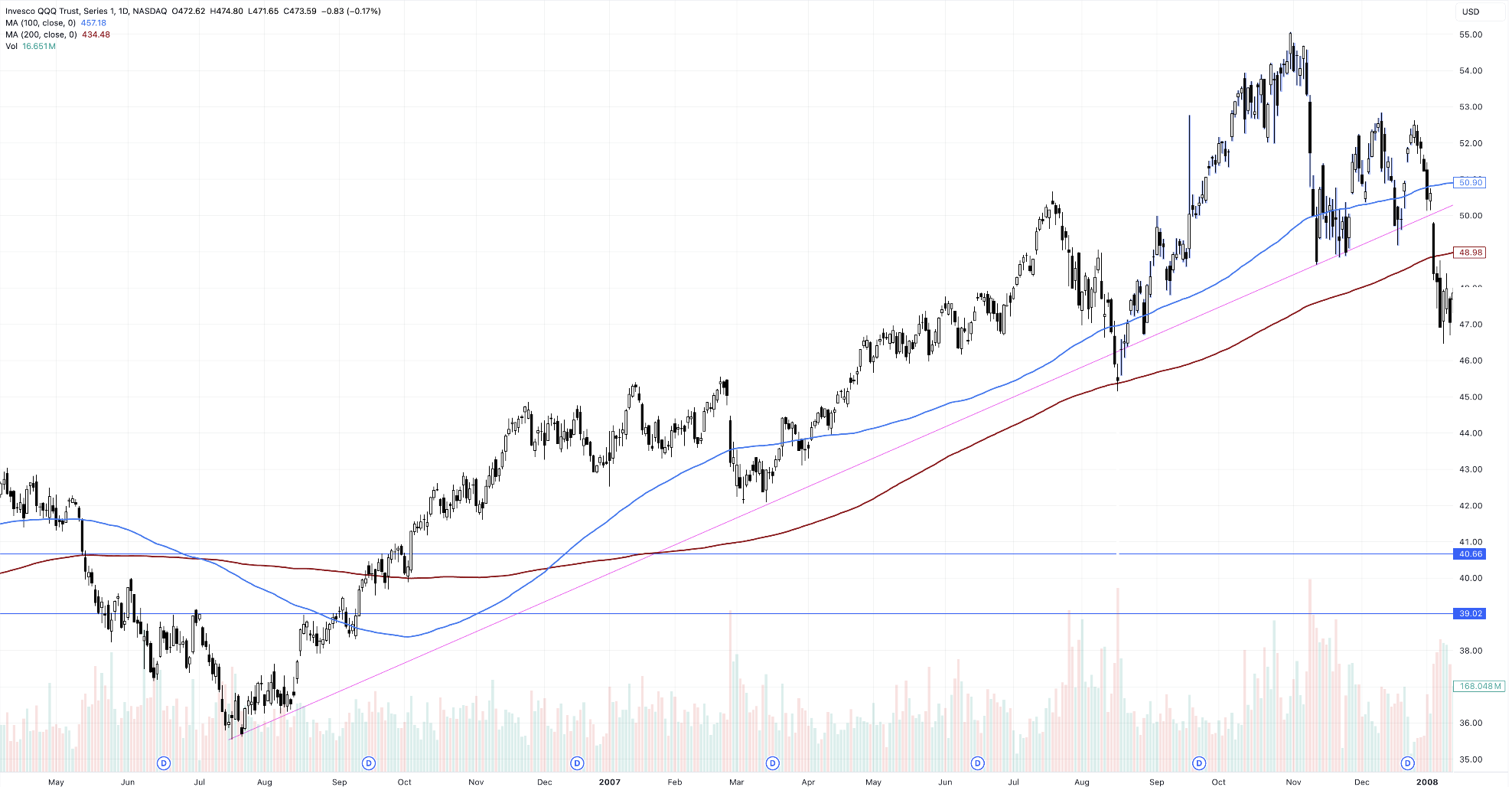
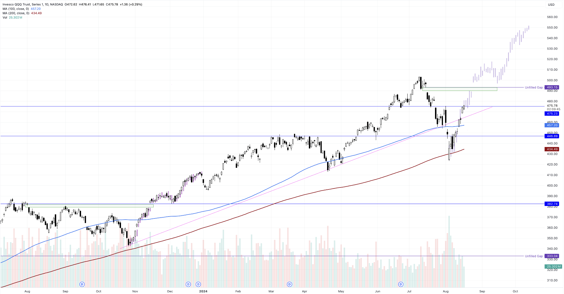
The next bars pattern comes from 2007, just before the market peaked and started its Great Recession decline. The 2007 bull market was a rip-roaring one, following a steep trendline into new highs until the trendline was broken on 8/16/07, bringing the price down just below the 200DSMA. It swiftly recovered into new highs, where the market eventually topped at the 1.764 extension level.
In my opinion, the 2007 bars pattern has the most similarities to the current market. Not only are the chart patterns extremely similar, but the dates and even the economic news were alike. Check out this article from exactly 17 years ago, published on August 16, 2007, with the line, “Will the Fed save the day? After holding short-term interest rates steady at 5.25 percent for more than a year, many investors and other Wall Street pros are looking to the Federal Reserve to cut interest rates at the central bank's upcoming policy meeting on Sept. 18.” That line could be written nearly word for word today, 17 long years later. I think Mark Twain was on to something.
Now, I’m not saying this next move will be the top of the market before a 50% decline. What I am saying is that if the QQQ hits $550.00 before year-end, I will be raising cash like I’m a full-time cash herder.
2007 Original Bars Pattern

2007 Bars Overlay

Up next, we are going to time travel to 2014. The market had been in a blistering bull trend since the yearlong correction in 2012 and was trending higher for the last 481 candles. Our current bull market has been churning higher for the last 453 days as of the August 5th low. The September 2014 correction retested the 200DSMA with two bullish candles briefly piercing through it. The move back up into new highs was extremely fast and aggressive, taking only 16 days. The move continued higher until it reached the 1.5 extension level, then pulled back into the long-term moving averages to consolidate. After the bars pattern, it continued slightly higher and then proceeded to chop sideways for the next 600 days.
While we're on the topic of similar price patterns, check out how similar the recovery in July 2016 was to the recovery in October 2014.
2014 Original Bars Pattern

2014 Bars Overlay

Our next bars pattern comes from recent history in 2022. The COVID recovery had been underway for a year and a half, and the QQQ had not once touched its 200-day simple moving average (200DSMA). The September/October 2021 correction was also shallow and unable to bring the price back to the 200DSMA, but it did reach the 100DSMA before making a swift and determined move higher. The recovery was nearly vertical, taking the QQQ to new highs in November and into the 1.764 extension level, mirroring the 2007 move. The QQQ then experienced a 37% drawdown over the following year.
2022 Original Bars Pattern

2022 Bars Overlay

The next bars pattern requires us to look at just one chart, as it happened a brief 9 months ago in November 2023. The overall correlation with these two moves is the least similar of the five, but the vertical V-bottom off the 200DSMA is strikingly similar, so it is worth examining. Our current correction was much steeper and more violent than the meandering, choppy correction of late summer 2023. However, both moves absolutely blasted off from their lows, gapping up nicely along the way. The move gapped over its main resistance level, retested it, and continued higher until, well, until today, technically.
2023 Original Bar Pattern & Bars Overlay

In conclusion, the brute strength shown over the last several days suggests that the markets could reach a new all-time high in a relatively short amount of time. However, vertical moves like the one we are experiencing now often lead to corrections in either price or time. If we continue trending higher into the election and the end of the year, it would be an opportune moment to lock in profits, trail stops, and raise cash, just in case history decides to drop a few bars of its own.
QQQ Raising the Bars

ABOUT REAL LIFE TRADING
We are a stock trading education company. Our goal is to teach and empower people to create generational wealth to enrich their lives and communities.
ONLINE TRAINING LINKS

